

When most folks think of fall, they picture cozy sweaters, cooler weather, and a lot of orange. But in the world of interior design, fall 2025 is shaping up a bit differently, especially here in the St. Croix Valley.
According to the latest color trend reports from Homes & Gardens and Vogue, the usual fall décor staples are taking a backseat to more refined palettes. These new combinations focus less on seasonal kitsch and more on adding depth, calm, and style that lasts beyond a few weeks of pumpkin spice season.
Whether you're updating your space for the season, prepping your home for market, or just like to keep up with what’s current, here’s a look at the designer-approved fall palettes we’re seeing this year.
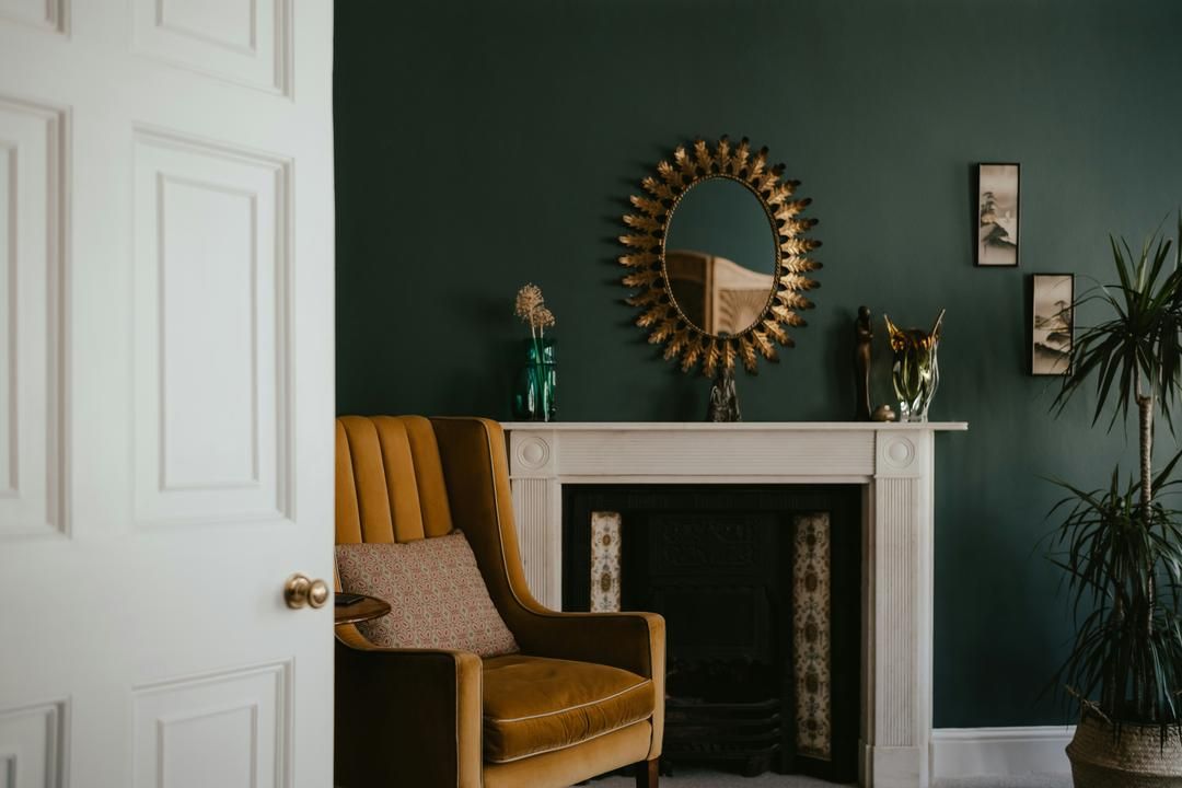
Sapphire, navy, and charcoal are standing in for black
If you’re looking for a way to make a room feel grounded without going full moody, dark blue is the standout. Homes & Gardens points to blue as one of fall’s most sought-after shades, especially in deeper tones like charcoal blue and navy. In the St. Croix Valley, these colors can complement the natural beauty of our surroundings, from the deep blues of the river to the charcoal hues of the local stone.
What makes these colors work is contrast. Instead of painting an entire room, designers recommend navy feature walls, charcoal bookshelves, or dark blue cabinetry paired with lighter neutral furnishings. Add in warm wood tones or a few gold accents, and the space feels intentional, not heavy. If you’ve been thinking about updating a room that gets a lot of evening light, these cooler, smoky shades create the kind of cozy that feels elevated instead of seasonal.
Plum and ochre feel luxe but not loud
The pairing of plum and ochre is showing up in everything from textiles to wall paint this fall. Plum is being used in velvets, deep florals, and statement art. Ochre, think soft gold or muted clay, is appearing in accent chairs, pillow fabrics, and ceramic pieces. In our local shops, you might find these colors in handcrafted items that reflect the artistry of the St. Croix Valley.
Both colors are saturated enough to create visual interest but soft enough to blend with neutral tones. According to Vogue’s recent color trend feature, purples and golds are making a comeback, but in more restrained, tonal ways. This palette works especially well when layered over taupe, greige, or mushroom tones, and can be pulled into a space through art, textiles, or accent furniture. For homeowners considering small updates before selling, these colors are an easy way to make a space feel thoughtful and current without repainting every wall.
Mushroom neutrals are the new go-to base
If there’s one theme that’s holding steady in fall 2025, it’s neutrals, but not just any neutrals. The new favorite is what designers are calling mushroom. These are soft grays and taupes with brown undertones, warmer than traditional gray and easier to pair with both cool and warm colors. In the St. Croix Valley, where nature provides a rich backdrop, these tones can mimic the soft hues of the changing leaves.
In homes being prepped for market, mushroom works well for upholstery, rugs, and even painted cabinetry. Unlike stark white or builder beige, it adds warmth without reading as dated or flat. It also gives future buyers a sense of calm and flexibility, making it easier to picture their own belongings in the space. If you're staging or refreshing a room this fall, mushroom tones create a grounded backdrop for layering in deeper fall accents.
Burnished gold and oxblood are replacing bright metallics
Traditional golds and brassy finishes are being replaced this season with more muted versions—burnished gold, aged brass, and brushed bronze. These finishes still add warmth but with less shine, which helps a room feel composed instead of flashy. In the St. Croix Valley, where rustic charm meets modern style, these tones can enhance the character of your home.
At the same time, oxblood is making its way into interiors in small, high-impact doses. You might see it in a leather ottoman, a piece of abstract art, or a bold accent pillow. It brings richness to a space and pairs well with both neutrals and other jewel tones. Designers are using these colors to create visual points of interest. If you're adding seasonal accessories or highlighting a built-in feature, this is an easy way to add depth without having to commit to a major update.
Earthy greens are being used as calming accents
Greens are still trending, but they’ve shifted from olive and emerald to more grounded, earthy tones. Homes & Gardens highlights moss, sage, and dill as top color picks for fall. These shades are muted enough to feel subtle, but still bring a sense of nature indoors. In our area, these colors can reflect the lush landscapes and wooded areas that define the St. Croix Valley.
Earthy greens are especially useful in kitchens, entryways, and home offices, anywhere you want a color that helps the space feel both structured and relaxed. We’re seeing them used in cabinetry, painted furniture, and even window treatments. In homes that already lean neutral, adding this kind of green through art, vases, or soft textiles brings the right amount of seasonal energy without going overboard.
How to update a space without a full redesign
One thing that makes these 2025 fall palettes so approachable is that they work well in small doses. You don’t need to repaint your entire house or redo your furniture. Many of these tones can be introduced through textiles, accessories, or a few strategic paint choices.
Try a bold wall or built-in
Accent walls are still very much in play. A navy or charcoal wall in a bedroom, dining room, or home office instantly shifts the mood. Painted built-ins or shelving units are another way to bring in color without committing to a full room transformation.
Layer texture with color
The colors designers are recommending this season also lean heavily on texture. Velvet, wool, boucle, and natural ceramics help reinforce the warmth of a space. A mushroom-tone boucle chair paired with a gold-toned lamp or a plum velvet throw can create a moment in a room that feels seasonal but still cohesive.
Use art and accessories to rotate seasonally
You don’t have to fully redecorate to acknowledge the season. Wall art in oxblood or moss green, decorative bowls in soft ochre, or even books grouped by color are enough to set the tone. These are easy to change out later, which is helpful both for homeowners who like variety and for sellers looking to update without investing in permanent changes.
Palette pairings we’re seeing this fall
Here are a few combinations designers are working with right now:
- Navy with mushroom and aged brass
- Plum with ochre and soft white
- Moss green with charcoal and walnut
- Oxblood with taupe and brushed bronze
- Sage green with ivory and burnished gold
Each of these palettes works across a range of design styles, from contemporary to traditional, and can be adjusted with small changes in tone or texture. They’re also useful for sellers who want a home to feel current but not overly stylized.
A season for subtle shifts
Fall tends to bring out a desire to make spaces feel more comfortable and grounded. These updated palettes help with that without relying on the usual seasonal themes. They feel warm and composed, not overly decorated.
If you're considering a small refresh this season, or you're thinking about how your home will show to potential buyers, these palettes offer a good place to start. A few thoughtful choices can shift the entire feel of a room without requiring a major investment.


